Thursday, March 31, 2011

The Official Kick-off to the Planting Season! - Mar 31

The Official Kick-off to the Planting Season!
March 31st, 2011


Planting Intentions

March 31st is here, and it is one of my favorite days of the year!  Due, of course, to the release of the USDA Prospective Planting report, the first official estimate of what U.S. farmers will put in the ground.  The report often sends markets flying or crashing on unexpected numbers; today’s planting intentions however failed to provide any surprises.  As expected, corn acreage made gains at the expense of soybeans, with slightly more acres going to corn and slightly fewer acres going to the beans than was expected coming into the report.  Compared to last year however, corn has made significant gains.  Last year farmers planted 88.79 million acres of corn, and plan on seeding 92.17 million this year.  Farmers planted 78.96 million acres of soybeans last season, and will reduce plantings to 76.6 million acres this year.  One of the big factors driving this decision was the relative strength of new crop corn versus soybeans (December contract for corn, and November contract for soybeans).  One week ago, this ratio was around 2.17:1, making corn much more profitable than soybeans.  Generally this ratio is in equilibrium around 2.30 – 2.40 and over the past week the market adjusted, moving back in favour of soybeans, currently at 2.30.  Over the coming month, new crop soybeans may outperform corn in an attempt to prompt farmer to change their minds and plant beans instead.  From here, the markets will be at the mercy of Mother Nature, and traders will be watching weather for problems getting the crops planted.

Ending Stocks

Corn bulls will breathe a sign of relief at today’s stocks report, as traders have been whispering about a potential unexpected jump in supplies due to the USDA ‘finding’ more corn.  This did not materialize, and quarterly stocks came in below expectation at 6.523 million bushels.  This is very supporting of old crop corn futures, which are increasingly tight.  Soybean stocks are also lower than expected on strong export demand, particularly from China.  This should provide support to the grain complex.

Wednesday, March 30, 2011

Collapsing Cocoa - Mar 30

Collapsing Cocoa
March 30th, 2011


Reducing the Risk Premium

Despite ongoing violence and export disruptions in the Ivory Coast, cocoa lagged the commodity complex significantly over the past month.  Of the commodities included in the CRB index, cocoa was the worst performer, down 19.7 percent (see chart).  The next worst was orange juice, which was down only 10.23 percent.  Despite the massive selloff, cocoa prices are now down only slightly from a year ago (-3.47%).  What sparked this selloff? 

May 2011 Cocoa Futures
Courtesy of Bloomberg

Cote d’Ivoire

This conflict did not start after the election last year, but began almost a decade ago in 2002, when an uprising of mutinous military officers divided the country into a rebel-held north and a government controlled south.  The election last fall was expected to re-unite the country, but the incumbent President Laurent Gbagbo who lost to former Prime Minister Alassane Ouattara has thus far refused to step down.  Since the November election, government forces controlled by Gbagbo have engaged in battle with the Republican Forces controlled by Ouattara. 

In response, and with the purpose of cutting off funding to Mr. Gbagbo, Mr. Ouattara issued a ban on all exports of cocoa and coffee on January 24th.  The market continued to rally for more than a month, as concerns grew about the quality of the stockpiles that have built up in Abidjan, the commercial capital and major export hub.  While there is no shortage of cocoa beans (more on this later), the storage facilities holding the stockpiled crop were not designed for long term storage.  Analysts warn that if the beans do not go to market the crop could rot completely, and even with a speedy resolution there could be significant quality issues. 

Ouattara Making Progress

Since making its high on March 4th, cocoa has fallen precipitously, perhaps as market participant shift focus to the otherwise benign market fundamentals.  More recently, Ouattara’s Republican Forces have been making progress against the government forces, and this week took control of several villages only 240 km away from Abidjan.  They have also taken control of roughly half of the prized cocoa growing region.  Reports have been surfacing that Gbagbo’s forces have been refusing to fight and that there have been mass desertions and defections.  This has taken some of the pressure off the market, as expectations rise for a forthcoming resolution, or at least for Ouattara to take control of Abidjan, and thus cocoa exports. 

The market didn’t even blink at the announcement on March 28th that the export ban, which was due to expire at the end of the month, would be extended indefinitely.  Market participants have been obeying the order, in part due to fear that they will be double taxed (by both Gbagbo and Ouattara), and in part due to the threat that anyone who contravenes the ban may lose their export license and be banned from operating across the national territory.

Global Supply and Demand

While the Ivory Coast is the world’s largest producer, neighboring Ghana how grows roughly half as much, and exports have been surging this year.  A recent estimate forecasts exports to rise 50 percent this year, from 400K tonnes to 600K tones.  Overall, the International Cocoa Organization had forecast a global surplus of 119K tonnes, following last year’s deficit of 66K tonnes.  Ivory Coast output was expected to rise 6.7 percent to 1.325 million tonnes.  With at least 475K tonnes sitting in warehouses, not available to the market, and possibly rotting, the expected surplus could easily turn into a deficit. 

Speculators are Booking Their Profits

Since the market reached its peak, large speculative accounts (based on the CFTC’s data on large non-commercial traders) have been liquidating their long positions in cocoa.  This has probably helped push prices lower, and signifies the change in sentiment.  If these traders continue to sell their positions, this selloff could persist for a while.

Large Speculative Traders’ Net Position
Courtesy of Bloomberg

Cocoa is traded in New York on the Nybot-ICE Futures exchange and in London on the NYSE-Liffe exchange.


-Jaime Macrae, CIM
Account Executive, Friedberg Mercantile Group
jmacrae@friedberg.ca

Tuesday, March 29, 2011

Gasoline's Time to Shine - Mar 29th

Seasonality in the Crack Spread
March 29th, 2011


Some Background

For those of us who are not involved in the energy trade, the ‘crack spread’ can be a bit of a mystery, however I will endeavor today to illuminate this very important corner of the oil market.  The crack spread represents the profit that an oil refinery can make by ‘cracking’ a barrel of oil into refined products, specifically gasoline and heating oil.  While there are many different ratios and incarnations of this spread, the most commonly quoted and widely watched is the 3:2:1 spread.  The 3:2:1 represents three contracts of crude oil, against 2 contracts of gasoline and 1 contract of heating oil.  This ratio roughly characterizes the output from refining crude oil.  When one is referred to as having bought the crack spread, it means they have sold 3 contracts of crude oil and purchased 2 contracts of gasoline (RBOB) and 1 contract of heating oil, in hopes that the prices of the refined products will gain on that of crude oil.  Conversely, being short the crack spread would mean buying crude and selling the products. 

Since last fall, the crack spread has risen materially, and in absolute terms recently made a new all-time high of over $25 per barrel (see chart). 

3:2:1 Crack Spread
Courtesy of Bloomberg

The Seasonality of Refined Products

The general rule of thumb when it comes to the seasonality of the refined products is that heating oil is strong in the winter months, when demand rises in response to cold weather, and gasoline is strong in the spring/summer months when more people ‘hit the road’ boosting demand for the fuel.  This seasonality is clearly demonstrated in the forward curve for RBOB gasoline futures (see chart), with higher prices seen in the summer months.

Forward Curve of RBOB Gasoline
Courtesy of Bloomberg

Spread Between RBOB Gasoline and Heating Oil
Courtesy of Bloomberg

As the chart above demonstrates, (with the exception of 2008) gasoline generally trades at a premium to heating oil starting somewhere around February or March, and trades at a discount sometime towards the end of the summer.  Currently the two products are trading at nearly the same price, and the trend is in favour of the RBOB, as would be expected based on historical seasonality. 


-Jaime Macrae, CIM
Account Executive, Friedberg Mercantile Group
jmacrae@friedberg.ca

Monday, March 28, 2011

High Prices Spur Coffee Sales - Mar 28th

High Prices Spur Coffee Sales
March 28th, 2011


Worst Performer

Coffee has been the weakest of the commodity markets over the past week, bucking a long-term uptrend while the rest of the commodity complex showed broad strength.  Coffee prices have been steadily rising since the beginning of 2010, as demand rebounded from a slight decline in 2009, and the supply side of the balance sheet recovered from the biggest deficit since at least 1980.  The market also benefited from a steadily depreciating U.S. dollar over the same timeframe.  World coffee ending stocks in terms of usage remain near historical lows, sitting at just under 25 percent at the end of 2010.  The last time coffee prices reached these levels was back in 1997, when prices reached a high of $3.18 per pound, while the global supply of coffee remained in a deficit for a 5-year stretch from 1995 to 1999.  The fact that coffee prices have shown such weakness in the face of broad-based commodity strength is likely a reflection of exporters bringing supply to the market to take advantage of such historically high prices.

Backwardation and Exports

Over the past month, the forward curve for London-traded robusta coffee futures has shifted from a slight contango (the ‘normal’ state of the market, where deferred months trade at a premium to spot, reflecting storage and insurance costs), to a steep backwardation between the May and July contracts.  When a market is in backwardation is means that near month contracts trade at a higher price than those further along the forward curve, and usually indicates that there is a short term supply crunch (see chart).

LIFFE Robusta Forward Curve
Courtesy of Bloomberg

The premium available on coffee for immediate delivery has attracted sellers to the market, with first-quarter exports from Vietnam (the world’s top producer of Robusta coffee) expected to rise 46 percent from last year to 509,000 tonnes.  Luong Van Tu, the Chairman of the Vietnam Coffee & Cocoa Association told reporters that, “Farmers took advantage of the high prices and sold out most of their product.”

Robusta vs. Arabica

The rising price of high-quality arabica beans has outpaced the gains of robusta beans, spurring some roasters to push the limits of robusta inclusion in their blends.  The ratio of arabica to robusta, typically about 1.95:1 has been on the rise for months, peaking towards the end of December 2010, but still on the high end at around 2.30:1 (See chart).

Arabica : Robusta
Courtesy of Bloomberg

Speculative Position

Large speculative traders have held a sizeable long position in the ICE arabica coffee contract since last summer, and are have been liquidating the position since the beginning of the year, indicating that sentiment may be turning (see chart). 

Large Speculative Traders
Courtesy of Bloomberg

The sky-high price of coffee is also making its way into the mainstream media (sometimes viewed as an indication of a market top), and several large retail brands have recently announced price increases, including Folgers, Dunkin’ Donuts, Kraft Foods Inc., and Green Mountain. 

Technical Outlook

Taking a look at the price in New York (ICE contract), recent price action resembles a classic ‘head-and-shoulders’ pattern.  While I am certainly not a technician, it is worth noting, as you can be sure other market participants will be watching for a break below the 255-260 range as confirmation of a market top pattern. 

ICE Arabica Coffee Price
Courtesy of Bloomberg


-Jaime Macrae, CIM
Account Executive, Friedberg Mercantile Group
jmacrae@friedberg.ca

Friday, March 25, 2011

GSR - Mar 25th

Gold/Silver Ratio
March 25th, 2011


Historical Extreme?

Precious metals traders have been watching the ratio between gold and silver for years, measuring how many ounces of silver it takes to buy one ounce of gold.  Over the past couple of decades this ratio has been particularly volatile, reaching nearly 100:1 in the early 1990s, and now at a multi-decade low of around 39:1.  There’s no mystery regarding how this ratio has come down to such a depressed level (though we will be examining whether or not this is actually a depressed level), as silver’s rise has been outpacing that of gold significantly, especially over the past year.  Over the past 12 months, silver has risen over 121 percent, while gold has risen only 30 percent.  The last time we saw the Gold/Silver Ratio (GSR) at this level was back in the early 1980s, when the Hunt brothers attempted to corner the silver market sending prices skyrocketing, albeit very briefly, and then once again a few years later. 

Going off of recent memory alone, the current GSR would appear to be overextended on the downside, but what if we look back even further?  Below is a chart of the GSR going back to 1950, when the prices of the precious metals were essentially flat.  I have also included a chart of the actual prices for the two going back to the same time-period.

Gold/Silver Ratio
Courtesy of Bloomberg

Gold and Silver
Courtesy of Bloomberg

As the charts show, the GSR has now returned to approximate level where it remained steadily for decades before the precious metals were freely traded. 

Looking back even further, much, much, further, we see that during the middle-ages the GSR was steady at around 16:1.  Interestingly enough, this ratio is seen elsewhere in the precious metals market; in 2009, the last reliable data available, total mine production of silver was approximately 16 times that of gold.  Taking a longer term view of this relationship, it begs the question of whether the GSR is really at an extreme level, or if it is merely returning to a long-term historical norm.

One thing is for sure, this has been a volatile relationship ever since the 1970s.  Below is a regression showing the monthly prices going back to 1980.  The asterisk at the top right-hand corner denotes the current level.

Regression
Courtesy of Bloomberg

-Jaime Macrae, CIM
Account Executive, Friedberg Mercantile Group
jmacrae@friedberg.ca

Thursday, March 24, 2011

Nat Gas - Mar 24th

Natural Gas
March 24th, 2011


Japanese LNG demand

Natural gas has been one of the top performing commodities over the past month, rising 11.36 percent, and surpassed only by the high-flying silver and cotton markets.  One of the major drivers of the recent gains has been the expectation for increased LNG demand from Japan.  While there is little doubt that Japan will need to increase LNG (Liquefied Natural Gas) imports, this will have little or no effect on U.S. natural gas, especially in the short term.

A little bit of background on Japanese LNG demand.  Japan is the world’s biggest importer of natural gas, accounting for over 35 percent of global trade.  The Asian nation uses LNG for around 17 percent of its heating and power needs, a number that will certainly increase in light of decreased electrical supply from its damaged and disabled nuclear facilities.  Japan, lacking significant domestic supplies, relies heavily on imports from the Middle East and Asia to meet its needs.  A closer look at who sells Japan its LNG reveals that over 60 percent of its supplies come from Indonesia, Malaysia, and Australia, each of which represents roughly 20 percent.  By comparison, the United States supplies a mere 0.5 percent of Japanese LNG. 

Natural gas is not a global market like crude oil.  With the exception of LNG, it cannot be shipped easily over land and sea.  Natural gas markets develop locally, where pipelines connect producers and consumers.  The obvious example is North America, where a highly interconnected market exists.  North American prices however, are not clearly linked to those in Europe for example, as local natural gas cannot be easily transported via pipeline to overseas markets.  The recent development of the LNG market is changing things, but the U.S. is not an active participant.  While the U.S. does take in some LNG shipments, most of it is re-exported to other markets.  Last year LNG represented only 1.7 percent of U.S. supply.  Even if all of this was diverted to Japan, it would not have a huge effect on the domestic market, which is already oversupplied as a result of heavy investment in shale development. 

So, one might ask whether the U.S. will start exporting some of its excess gas to Japan?  The answer is maybe, but not anytime soon.  The Gulf of Mexico has LNG import terminals that could be converted to handle exports, but currently there are no LNG export terminals in the continental United States (there is one in Alaska that is likely to be closed due to insufficient volumes). 

In the end, the boost that the natural gas market has experienced due to the Japan story is overdone, or even outright misguided.  There are however other factors to consider.

US Nuclear Energy

The nuclear disaster in Japan has brought about a lot of scrutiny on U.S. nuclear energy producers.  Nuclear power provides around 20 percent of U.S. electricity.  On March 21st, Bill Borchardt of the U.S. Nuclear Regulatory Commission said the U.S. will conduct a 90-day safety review at the country’s 104 nuclear reactors.  This could cause some temporary disruptions to power supply and provide a brief increase in demand for natural gas-fired electrical production. 

U.S. Energy Mix – NG vs. Coal, NG vs. Oil

Coal fired power plants are the biggest provider of electricity in the United States, followed by natural gas fired power plants, which generated about 24 percent of the power supply last year.  Coal prices have risen steadily for the past year, with some indices showing an increase of nearly 75 percent.  Natural gas, on the other hand, has remained relatively flat to lower over this timeframe.  The best possible news that natural gas bulls can hope to hear is widespread switching from coal to natural gas by power plants. 

Crude oil has been on a tear recently, fueled in part by supportive fundamentals, and accelerated by tensions in the Middle East.  During this period of rising prices, natural gas has not participated; in fact prices have actually declined (until recently).  To illustrate the divergence in energy costs, I have included two charts below.  Crude oil contains 5.826 mmbtu per barrel, and the price of U.S. natural gas is quotes in dollars per mmbtu (Million British Thermal Units).  The first chart shows the price of crude oil and the natural gas energy equivalent price per barrel.  The second shows the ratio of crude to the energy equivalent cost of natural gas. 

Crude Oil and Barrel of Oil Equivalent Natural Gas
Courtesy of Bloomberg

Crude Oil : BOE NG
Courtesy of Bloomberg

The timing of the divergence seems to support the notion that the decline in natural gas is closely linked to the increase in shale development in recent years.  If the relationship between natural gas and crude oil were to return to historical norms, we could expect sharply higher natural gas, and/or much lower crude. 

Wednesday, March 23, 2011

Copper - Mar 23rd

Copper
Wednesday, March 23rd 2011


Misleading Headlines

Copper is the top performing commodity of today’s session thus far; however the catalyst for the rally is somewhat suspect.  Aside from a couple of high profile supply and demand estimates (more on this below); the big headline was a 45% increase in cancelled warrants at the LME.  Market commentators made much of the fact that this was the biggest increase since April 21st of last year.  Let us be clear, it was the biggest increase in percentage terms only.  In absolute terms, the increase was only 4800 tonnes, which is not an uncommon number (there were two days in February that saw a jump of greater than 4000 tonnes), and is only the highest reading since January 10th of this year. 

For those of you who aren’t professional base metal traders, you may be asking, “What are cancelled warrants, and what do these changes mean to the market?”  Allow me to explain.  An LME warrant is a document of title, representing a quantity of metal that conforms to LME delivery specifications, held within an approved LME warehouse, and most importantly it is tradable.  Once an LME warrant is cancelled, the metal is supposed to be earmarked for delivery, even though it may remain in the warehouse.  By comparison, LME warehouse stock numbers include all metal in storage, whether it is available to be traded or not.  Many base metal traders watch the number of cancelled warrants as an indication of demand, with rising cancellations construed to mean greater demand (and therefore higher prices). 

Now, back to today’s rally.  Let’s put the increase into perspective.  Below is a chart of LME cancelled warrants as a percentage of total inventories.

Cancelled warrants as % of total LME inventory

Courtesy of Bloomberg

The chart clearly shows that despite the attractive headline increase of 45%, this is not really that big of a change, and in fact cancelled warrants represent a much smaller percentage of total inventories than they did last year when the price was much lower. 

There are a couple of other points to consider.  First of all, in regards to the cancelled warrants, there is the possibility that someone might cancel warrants (remember that this means they tell an exchange clerk that the metal is no longer available even though it can remain in the warehouse) even though the metal has not been sold, and then leave it in the warehouse or move it to another storage facility.  A trader might do this to create the appearance of demand, in the hopes of pushing the price up.  In the case of the current copper market, the risk of such manipulation is even greater as the March 21st LME report revealed that a single participant controls between 50 and 79 percent of the exchange’s warrants! 

It is also interesting to note that traditional relationship between inventories and price has broken down in recent times.  Below is a chart showing the price of copper and LME inventories between 2004 and 2008.  As you can see there was a strong negative correlation. 

LME copper inventories vs. price

Courtesy of Bloomberg

More recently however, the price of copper continues to march forward despite rising inventories.  The chart below shows global exchange inventories (LME, Shanghai, and Comex combined in tonnes) vs. Comex copper.  As you can see the same negative correlation no longer holds true.

Global exchange copper inventories vs. Comex copper

Courtesy of Bloomberg

Supply and Demand Imbalance

Also adding to today’s strength were two reports indicating a growing deficit in the copper market.  Barclays Capital said it expects copper demand to outstrip supply by 889,000 tonnes in 2011, and the International Copper Study Group predicted a 435,000 tonne shortfall.  These compare to a 305,000 tonne deficit in 2010 and a 175,000 surplus in 2009.  Growing demand from China, now representing 45% of global demand, has been the main driver of the tight supply and demand situation; however customs data shows that imports fell to a 2 yr low of 158,185 tonnes in February.

 
-Jaime Macrae, CIM
Account Executive, Friedberg Mercantile Group
jmacrae@friedberg.ca

Tuesday, March 22, 2011

Grain Outlook - Mar 22nd


Grain Outlook
Tuesday, March 22nd 2011


Dwindling Supplies

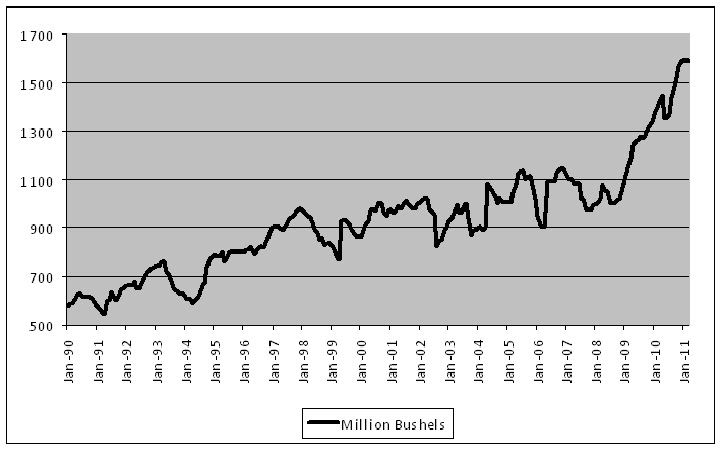
Tight supply and demand fundamentals have underpinned this year’s steadily rising prices, with ending stocks for both corn and soybeans projected at the low end of the historical range.  The March 10th WASDE report from the USDA pegged ending stocks for corn at 675 million bushels, and soybean stocks at 140 million bushels.  The charts below show the USDA ending stock estimates going back to 1990. 

Based on the USDA’s estimate of total consumption, this will leave the U.S. with only 17 days supply of corn, and a mere 15 days supply of soybeans.  As the summer progresses, we can expect this to keep old-crop futures well bid.  It could also pressure old/new-crop spreads to widen.  Since mid-January, the spread between near month futures and November beans has fallen dramatically, and are now close to historical norms.  Corn spreads have also narrowed since the beginning of the month, though they remain quite wide.

USDA ending stocks - Corn


Courtesy of Bloomberg


USDA ending stocks – Soybeans


Courtesy of Bloomberg 

Export Demand

The pace of soybean exports has been rising rapidly in recent years, driven largely by voracious demand from China.  Total U.S. exports have nearly doubled in the past few years, reaching a new all-time high in 2010/11, and now represent about 47 percent of total production.  Below is a chart of U.S. soybean exports since 1990.

USDA total exports – Soybeans


Courtesy of Bloomberg


Alternative Fuels

Ethanol producers continue to demand even greater quantities of corn, this year setting a new record at 4.950 billion bushels of corn.  This amount represents over 36 percent of total corn use, and nearly 40 percent of current U.S. production.  Increased demand from ethanol is outpacing production gains significantly.  The chart below shows the percentage of U.S. corn production that is used to make ethanol since the USDA began reporting in 2004.

Total corn demand for ethanol as % of total production


Courtesy of Bloomberg

Usage is unlikely to decline in the near term due to the improving economics of blending ethanol, as the price of gasoline has increased at a much faster pace than the alternative fuel.  Add to that the $0.45/gallon Volumetric Ethanol Tax Credit available to blenders, and the EPA’s recent approval of E15 (15% ethanol mixed with gasoline) for use in newer cars, and the outlook for continued strong demand looks good.

On the other-hand, production of biodiesel made from soybean oil has been steadily declining since its peak of 691 million gallons in 2008, and has been more than halved to 315 million gallons in 2010, according to the NBB (National Biodiesel Board).

Planting Intentions

While traders are certainly waiting for the March 31st Prospective Plantings reports to set the tone for spring markets, last month’s USDA Annual Outlook Forum gave an early indication of what to expect.  Joe Glauber, the USDA’s chief economist told the audience to anticipate 225 million acres to be dedicated to major field crops, a 9.8 percent increase from last year, and the highest since 1998.  Of those acres, he expects 92 million to be planted with corn (an increase of 3.8 million acres), and 78 million to be planted with soybeans.  Assuming that 84.9 million acres are harvested, and a trend yield of 161.7 bushels per acre, this points to a record corn crop of 13.73 billion bushels.

One reason for the large increase in anticipated planted acreage is the expectation for significant double cropping in the Corn Belt, where winter wheat planting was up 47%.  Double cropping entails planting soybeans in freshly harvested wheat fields, which are generally harvested a bit early to ensure that the soybeans are planted in time since crops sown after early July suffer from greatly diminished yields.  Glauber estimates that between 5 and 6 million acres will be double cropped this season.

Some private forecasts are less optimistic about soybean acreage.  A recent survey conducted by Allendale Inc. indicated farmers were planning to sow 92.291 million acres of corn, and 77.193 million acres of soybeans.  Informa Economics Inc. released their updated planting forecast on Friday, in which they raised their outlook for corn plantings from 90.903 million acres in January to 91.758 million acres.  For soybeans, they reduced their outlook to 75.269 million acres from 76.654 million in January, well below the USDA’s estimate.


Beans vs. Corn

For the past several months the soybean to corn price ratio has favoured corn planting, trading as low as 2.16:1 earlier this month (the old crop ratio got as low as 1.87:1 at the beginning of March).  The past few weeks, however, have seen the ratio return closer to equilibrium at around 2.25:1.  While optimal ratios of soybeans to corn vary depending on the region, the general rule of thumb is soybeans should cost 2.4 times as much as corn to reflect differences is expected yields and production costs.  Below is a chart showing the ratio of new crop beans to corn since 2005.

Soybeans/Corn price ratio


Courtesy of Bloomberg

Back in 2007 and 2008, when the ratio was below 2:1, corn production was increased substantially at the expense of soybeans. 

Japan

In the aftermath of the devastating earthquake/tsunami/nuclear events in Japan, grain traders have been asking, how will this affect markets? 

Japan in the biggest foreign market for U.S. corn, importing nearly 600 million bushels last year to be processed into livestock feed.  Initial reports suggest as much as 20 percent of the nation’s feed production could have been affected by the tsunami, which could reduce demand in the short term.  In addition, 2 of the 12 major ports that handle grain shipments have been damaged, which may delay imports over the next month or so while repairs are made, though Japan’s ports are expected to be back in full operation within a few weeks.  In all, expect only a short term disruption to export demand from Japan, with delayed shipments but no significant cancellations. 

It is not yet clear how pronounced the effect of the nuclear situation will be on future grain production in Japan, in particular, how much cropland will be lost due to radioactive contamination.  At the moment, it appears that only an area within a 10-mile radius of the plant has been contaminated, but only time will tell. 

The 2 primary contaminants released by the fuel rods are Iodine 131 and Cesium 137.  The iodine has a very short half-life of only 8 days, so it does not have any long term implications; however cesium 137 has a half-life of 30 years, meaning the radioactivity decreases by half every 30 years.  Cesium is absorbed into the soil, so needless to say, if there is widespread contamination it could take hundreds of years for the effects to completely dissipate.  Farmer can reclaim lost cropland by removing the top 10cm of soil, depending on how severe the contamination.

-Jaime Macrae, CIM
Account Executive, Friedberg Mercantile Group
jmacrae@friedberg.ca